CSS (Cascading Style Sheets)
🎨 How To Add CSS: 3 Easy Ways to Style Your Website
Want to make your website look amazing with CSS? Here are three simple ways to add CSS and control how your WordPress or HTML pages appear:
1️⃣ Inline CSS
You can apply styles directly inside an HTML tag using the style attribute.
<p style="color: blue; font-size: 18px;">This is a styled paragraph.</p>
❌ Not ideal for larger websites.
2️⃣ Internal CSS
Use the <style> tag inside the <head> section of your HTML or WordPress page (via custom HTML blocks).
<style>
  h1 {
    color: green;
    text-align: center;
  }
</style>
✅ Good for single pages or WordPress headers.
❌ Not reusable across multiple pages.
3️⃣ External CSS
Link an external .css file using the <link> tag.
<link rel="stylesheet" href="styles.css">
🎨 How to Add CSS – Hierarchy & Benefits Explained
Want to style your website but unsure how to begin with CSS?
Here’s the CSS hierarchy — from beginner to advanced — and how it fits into WordPress too:
1️⃣ Inline CSS
👉 Added directly to HTML element
✅ Quick fixes
❌ Not reusable
2️⃣ Internal CSS
👉 Inside <style> tag in HTML <head>
✅ Great for single-page sites
❌ Slows down large projects
3️⃣ External CSS
👉 Linked .css file
✅ Best for WordPress themes & plugins
✅ Clean & reusable
✅ SEO and performance friendly
4️⃣ CSS-in-JS (e.g., styled-components)
👉 Dynamic styles inside JS files
✅ Great for React/Next.js
❌ Not typically used in WordPress
5️⃣ Utility-first CSS (Tailwind CSS)
👉 Class-based styling
✅ Fast prototyping
🧾 CSS Syntax Explained
CSS syntax is made up of selectors and declarations inside curly braces.
selector {
  property: value;
}
✅ Example:
p {
  color: blue;
  font-size: 16px;
}
p→ Selector (targets all<p>tags)color&font-size→ Propertiesblue&16px→ Values
📌 Each declaration ends with a semicolon (;)
📌 Multiple declarations are wrapped in { }
💡 Tips
- Always use meaningful selectors (avoid too many
*orid-based styles) - Use shorthand properties (
margin: 10px 20px;) for cleaner code - Group styles for readability:
h1, h2, h3 { color: #333; }
🎯 5 Types of CSS Selectors – Explained with Examples
✅ 1. Simple Selectors
Select elements by name, class, or ID.
| Selector | Example | What it selects |
|---|---|---|
| Element | p {} | All <p> tags |
| Class | .box {} | All elements with class="box" |
| ID | #header {} | The element with id="header" |
🔗 2. Combinator Selectors
Select elements based on relationships.
| Combinator | Example | Description |
|---|---|---|
| Descendant | div p | All <p> inside <div> |
| Child | div > p | Direct <p> child of <div> |
| Adjacent | h1 + p | First <p> after <h1> |
| General | h2 ~ p | All <p> siblings after <h2> |
🧠 3. Pseudo-Class Selectors
Apply styles based on element state.
| Selector | Example | Description |
|---|---|---|
:hover | a:hover {} | On mouse hover |
:first-child | li:first-child {} | First child |
:nth-child(2) | li:nth-child(2) {} | Second child |
:focus | input:focus {} | Input in focus |
🎨 4. Pseudo-Element Selectors
Style specific parts of elements.
| Selector | Example | Description |
|---|---|---|
::before | p::before {} | Insert content before element |
::after | p::after {} | Insert after element |
::first-letter | p::first-letter {} | Style first letter |
::first-line | p::first-line {} | Style first line of paragraph |
🏷️ 5. Attribute Selectors
Target elements by attribute or value.
| Selector | Example | What it selects |
|---|---|---|
[type] | input[type] {} | Any input with a type attribute |
[type="text"] | input[type="text"] {} | Only text inputs |
[href^="https"] | a[href^="https"] {} | Links starting with https |
[data-role="admin"] | [data-role="admin"] {} | Elements with data-role="admin" |
Here’s a WordPress-friendly blog section on Simple CSS Selectors with both CSS and HTML examples:
Simple selectors allow you to style HTML elements by tag name, class, or ID.
🔹 1. Element Selector
CSS:
p {
  color: green;
}
HTML:
<p>This is a paragraph.</p>
<p>Another paragraph here.</p>
🎯 Applies green color to all <p> tags.
🔹 2. Class Selector
CSS:
.note {
  background-color: #f9f9f9;
  padding: 10px;
}
HTML:
<div class="note">This is a note.</div>
<p class="note">Another note in a paragraph.</p>
🎯 Styles all elements with class="note".
🔹 3. ID Selector
CSS:
#header {
  font-size: 24px;
  color: navy;
}
HTML:
<h1 id="header">Welcome to My Blog</h1>
🎯 Targets only the element with id="header".
💡 Best Practices
- Use classes for reusable styles
- Use IDs for unique elements
- Element selectors are great for global styling (like
body,p, etc.)
🔗 Combinator Selectors in CSS (With HTML Examples)
Combinator selectors style elements based on their relationship with other elements.
🔹 1. Descendant Selector (space)
CSS:
div p {
  color: teal;
}
HTML:
<div>
  <p>This paragraph is inside a div.</p>
</div>
<p>This one is outside and not styled.</p>
🎯 Selects all <p> elements inside any <div>.
🔹 2. Child Selector (>)
CSS:
ul > li {
  list-style-type: square;
}
HTML:
<ul>
  <li>Direct child</li>
  <div>
    <li>Nested child</li>
  </div>
</ul>
🎯 Selects only direct <li> children of <ul>.
🔹 3. Adjacent Sibling Selector (+)
CSS:
h2 + p {
  color: red;
}
HTML:
<h2>Title</h2>
<p>This paragraph comes immediately after h2.</p>
<p>This paragraph won't be styled.</p>
🎯 Selects the first <p> immediately after an <h2>.
🔹 4. General Sibling Selector (~)
CSS:
h2 ~ p {
  color: gray;
}
HTML:
<h2>Title</h2>
<p>First sibling</p>
<p>Second sibling</p>
🎯 Selects all <p> siblings after an <h2>.
✅ Summary Table
| Selector | Example | Selects |
|---|---|---|
A B | div p | All <p> inside <div> |
A > B | ul > li | Direct <li> children of <ul> |
A + B | h2 + p | First <p> right after <h2> |
A ~ B | h2 ~ p | All <p> after <h2> as siblings |
🎯 Pseudo-Class Selectors in CSS (With HTML Examples)
Pseudo-class selectors let you style elements based on their state, position, or interaction — like hover, focus, or first-child.
🔹 1. :hover – On Mouse Hover
CSS:
button:hover {
  background-color: orange;
  color: white;
}
HTML:
<button>Hover Me</button>
🎯 Changes button style when hovered.
🔹 2. :focus – When Element is Focused
CSS:
input:focus {
  border-color: blue;
}
HTML:
<input type="text" placeholder="Type here..." />
🎯 Highlights input box when clicked or focused.
🔹 3. :first-child – First Child in Parent
CSS:
li:first-child {
  font-weight: bold;
}
HTML:
<ul>
  <li>First Item</li>
  <li>Second Item</li>
</ul>
🎯 Styles the first <li> inside a list.
🔹 4. :last-child – Last Child in Parent
CSS:
li:last-child {
  color: red;
}
🎯 Styles the last <li> in a list.
🔹 5. :nth-child(n) – Target Specific Index
CSS:
li:nth-child(2) {
  color: green;
}
🎯 Styles the second <li> only.
✅ Bonus Pseudo-Classes:
| Selector | Use Case |
|---|---|
:checked | Style checked checkboxes |
:disabled | Style disabled elements |
:not(selector) | Exclude elements from styling |
🏷️ CSS Attribute Selectors (With HTML Examples)
Attribute selectors let you target elements based on their attributes or attribute values — powerful for forms, buttons, links, and custom data attributes.
🔹 1. [attr] – Has Attribute
CSS:
input[required] {
  border: 2px solid red;
}
HTML:
<input type="text" required />
🎯 Styles inputs that have a required attribute.
🔹 2. [attr="value"] – Exact Match
CSS:
input[type="email"] {
  background-color: #eef;
}
HTML:
<input type="email" />
🎯 Targets elements with an exact attribute value.
🔹 3. [attr^="value"] – Starts With
CSS:
a[href^="https"] {
  color: green;
}
HTML:
<a href="https://example.com">Secure Link</a>
🎯 Styles links that start with “https”.
🔹 4. [attr$="value"] – Ends With
CSS:
img[src$=".jpg"] {
  border-radius: 8px;
}
HTML:
<img src="photo.jpg" />
🎯 Styles images with .jpg extension.
🔹 5. [attr*="value"] – Contains Value
CSS:
a[href*="blog"] {
  font-style: italic;
}
HTML:
<a href="/my-blog-post">Blog</a>
🎯 Matches elements where the attribute contains “blog”.
✅ Summary Table
| Selector | Description | Example Use |
|---|---|---|
[attr] | Has attribute | [required] |
[attr="v"] | Exact match | [type="text"] |
[attr^="v"] | Starts with | [href^="https"] |
[attr$="v"] | Ends with | [src$=".png"] |
[attr*="v"] | Contains value | [href*="blog"] |
📍 CSS position Property – With Live Examples
The position property controls how an element is placed on the page. Let’s explore each value.
🔹 1. static (Default Position)
HTML:
<div class="static-box">Static Position</div>
CSS:
.static-box {
  position: static;
  background: lightgray;
  padding: 10px;
}
📌 Element stays in normal flow. top, left etc. won’t work.
🔹 2. relative
HTML:
<div class="relative-box">Relative Position</div>
CSS:
.relative-box {
  position: relative;
  top: 20px;
  left: 20px;
  background: lightblue;
  padding: 10px;
}
📌 Moves 20px from top and left of its normal place.
🔹 3. absolute
HTML:
<div class="container">
  <div class="absolute-box">Absolute Position</div>
</div>
CSS:
.container {
  position: relative;
  height: 200px;
  background: #eee;
}
.absolute-box {
  position: absolute;
  top: 10px;
  right: 10px;
  background: salmon;
  padding: 10px;
}
📌 Placed inside .container relative to its position.
🔹 4. fixed
HTML:
<div class="fixed-box">I’m Fixed</div>
CSS:
.fixed-box {
  position: fixed;
  bottom: 10px;
  right: 10px;
  background: green;
  color: white;
  padding: 10px;
}
📌 Always visible at bottom-right, even on scroll.
🔹 5. sticky
HTML:
<div class="sticky-box">Sticky Header</div>
<div style="height: 2000px;"></div> <!-- for scroll -->
CSS:
.sticky-box {
  position: sticky;
  top: 0;
  background: orange;
  padding: 10px;
  z-index: 1000;
}
📌 Acts like relative until scroll reaches top: 0, then sticks!
🎯 CSS display Property – inline, block, inline-block
The display property defines how an element behaves in the layout flow. Here’s a breakdown with examples:
🔹 1. display: inline
- Elements do not start on a new line.
- Width & height cannot be set.
HTML:
<span class="inline-box">Inline</span>
<span class="inline-box">Element</span>
CSS:
.inline-box {
  display: inline;
  background: lightblue;
  padding: 5px;
}
📌 Used for text-like elements (<span>, <a>) – flows inline.
🔹 2. display: block
- Elements start on a new line.
- Takes full width by default.
HTML:
<div class="block-box">Block Element 1</div>
<div class="block-box">Block Element 2</div>
CSS:
.block-box {
  display: block;
  background: lightgreen;
  margin: 5px 0;
  padding: 10px;
}
📌 Used for containers (<div>, <section>, <p>).
🔹 3. display: inline-block
- Elements do not start on a new line.
- Allows setting width and height.
HTML:
<div class="inline-block-box">Box 1</div>
<div class="inline-block-box">Box 2</div>
CSS:
.inline-block-box {
  display: inline-block;
  background: salmon;
  width: 100px;
  height: 50px;
  margin: 5px;
  text-align: center;
  line-height: 50px;
}
📌 Best of both worlds – flows inline and allows box sizing.
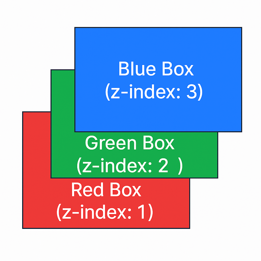
🧱 CSS z-index Property – Layer Like a Pro
The z-index property in CSS controls the stacking order of elements on the z-axis (front to back). Higher z-index values appear on top.
🟢 Syntax
selector {
  position: relative | absolute | fixed | sticky;
  z-index: value;
}
⚠️ Only works on positioned elements (
relative,absolute,fixed,sticky).
🔹 Example: Stacking Colored Boxes
HTML:
<div class="box red">Red Box (z-index: 1)</div>
<div class="box blue">Blue Box (z-index: 3)</div>
<div class="box green">Green Box (z-index: 2)</div>
CSS:
.box {
  position: absolute;
  width: 200px;
  height: 200px;
  color: white;
  padding: 10px;
}

.red {
  background: red;
  top: 20px;
  left: 20px;
  z-index: 1;
}

.green {
  background: green;
  top: 40px;
  left: 40px;
  z-index: 2;
}

.blue {
  background: blue;
  top: 60px;
  left: 60px;
  z-index: 3;
}
📌 The blue box will appear on top, followed by green, then red.
📦 CSS Box Model Explained (With Example)
The CSS Box Model is the foundation of layout design in CSS. Every HTML element is considered a box with the following structure:
+---------------------------+
|        Margin             |
|  +---------------------+  |
|  |     Border          |  |
|  |  +---------------+  |  |
|  |  |   Padding     |  |  |
|  |  | +-----------+ |  |  |
|  |  | |  Content  | |  |  |
|  |  | +-----------+ |  |  |
|  |  +---------------+  |  |
|  +---------------------+  |
+---------------------------+
📐 Box Model Components:
- Content – The actual text or image.
- Padding – Space around the content.
- Border – Wraps the padding and content.
- Margin – Space outside the border.
🧪 Example in Code:
<div class="box">Hello CSS</div>
.box {
  width: 200px;
  padding: 20px;
  border: 5px solid green;
  margin: 30px;
  background-color: #f0f0f0;
}
Result: The total width = 200 + 2×20 (padding) + 2×5 (border) + 2×30 (margin) = 310px + margins
📌 Use box-sizing: border-box; to include padding and border in total width:
.box {
  box-sizing: border-box;
}
✅ SEO/WordPress Tips:
- Add
alttext for diagrams. - Use schema like
FAQfor common box model questions. - Embed this in your blog using
preandcodetags for formatting.
🎨 CSS color Property – Text Color Styling
The color property in CSS is used to change the text color of an HTML element.
✅ Basic Syntax:
selector {
  color: value;
}
🧪 Examples:
1. Named Colors
p {
  color: red;
}
▶️ Supports names like blue, green, orange, etc.
2. Hex Codes
h1 {
  color: #3498db;
}
▶️ Popular for precise brand colors.
3. RGB
span {
  color: rgb(255, 99, 71); /* tomato */
}
4. RGBA (with opacity)
div {
  color: rgba(0, 0, 0, 0.6);
}
▶️ Adds transparency.
5. HSL (Hue, Saturation, Lightness)
h2 {
  color: hsl(240, 100%, 50%); /* blue */
}
💡 Pro Tips for WordPress Blogs:
- Use inline
<style>or CSS blocks inside<head>if no customizer. - WordPress page builders like Elementor or Gutenberg also allow direct color styling.
- Always use accessible color contrast (
WCAG) for readability.
🖼️ CSS Backgrounds – A Complete Guide
The background properties in CSS allow you to style the background of elements with colors, images, gradients, and more.
🎨 1. Background Color
div {
  background-color: lightblue;
}
▶️ Sets a solid color as the background.
🖼️ 2. Background Image
div {
  background-image: url('bg.jpg');
}
▶️ Sets an image as the background.
🔁 3. Background Repeat
div {
  background-repeat: no-repeat;
}
▶️ Options: repeat, repeat-x, repeat-y, no-repeat
📐 4. Background Size
div {
  background-size: cover;
}
▶️ Values: cover, contain, auto, or specific sizes.
🎯 5. Background Position
div {
  background-position: center center;
}
▶️ Aligns the image inside the element.
📌 6. Shorthand Property
div {
  background: url('bg.jpg') no-repeat center/cover;
}
🌫️ CSS Opacity / Transparency
The opacity property controls the transparency level of an element — including text, background, and borders.
🔢 Syntax:
cssCopyselector {
  opacity: value;
}
valueis between0(fully transparent) and1(fully opaque)
🧪 Example:
cssCopy.transparent-box {
  background-color: blue;
  opacity: 0.5;
}
htmlCopy<div class="transparent-box">Half Transparent Box</div>
⚠️ Note:
Using opacity affects entire element including its children.
✅ For only background transparency, use rgba or hsla:
cssCopy.box {
  background-color: rgba(0, 0, 0, 0.5);
  color: white;
}
▶️ This keeps text fully visible while background stays transparent.
🧩 Bonus: transparent Keyword
cssCopybackground-color: transparent;
▶️ Makes background fully invisible (default in many cases).
📏 CSS Units – Explained
CSS uses units to define length, size, spacing, etc. These are mainly of two types:
🔹 Absolute Units (Fixed Size)
Used when size must not change.
| Unit | Meaning | Example |
|---|---|---|
px | Pixels | font-size: 16px; |
cm | Centimeters | width: 10cm; |
mm | Millimeters | height: 5mm; |
in | Inches | width: 1in; |
pt | Points (1/72 in) | font-size: 12pt; |
pc | Picas (1/6 in) | font-size: 1pc; |
🔹 Relative Units (Responsive / Scalable)
Used to adapt to screen sizes and parent elements.
| Unit | Meaning | Example |
|---|---|---|
% | Percent of parent | width: 80%; |
em | Relative to parent font-size | padding: 2em; |
rem | Relative to root font-size | margin: 1.5rem; |
vw | % of viewport width | font-size: 5vw; |
vh | % of viewport height | height: 50vh; |
vmin | Smaller of vw or vh | font-size: 2vmin; |
vmax | Larger of vw or vh | padding: 4vmax; |
✅ Best Practice for Modern Web Design
- Use
remfor font sizes (easy to scale) - Use
%,vw,vhfor layout responsiveness - Avoid
pxfor accessibility unless necessary
🎯 CSS Specificity – Priority Rules
CSS specificity is a scoring system used by browsers to decide which rule wins when multiple rules target the same element.
🔢 Specificity Formula:
Inline > ID > Class/Attribute/Pseudo-class > Element/Pseudo-element
📊 Specificity Score Table
| Selector Type | Score |
|---|---|
Inline Style (style="") | 1000 |
ID Selector (#header) | 0100 |
Class (.btn), Attribute ([type]), Pseudo-class (:hover) | 0010 |
Element (div, h1), Pseudo-element (::before) | 0001 |
📌 Example:
<p id="title" class="highlight">Hello</p>
css { color: blue; }              /* 0001 */
.highlight { color: green; }    /* 0010 */
#title { color: red; }          /* 0100 */
🟢 Output: Red, since #title has the highest specificity.
⚠️ Important Rules:
- More specific selector wins.
- If same specificity: the one lower in the file wins.
!importantoverrides all unless multiple!importantrules exist — then specificity still applies.
✅ Best Practice:
Use meaningful class names and avoid excessive !important or deeply nested selectors.
📦 Understanding box-sizing in CSS (For CSS Developers)
The box-sizing property in CSS defines how the browser calculates the total width and height of an element.
🔍 Why It Matters
By default, when you set an element’s width and height, padding and border are added on top of those dimensions — often breaking layouts. box-sizing solves this by letting you choose how dimensions behave.
✨ Syntax
box-sizing: content-box; /* default */
box-sizing: border-box;  /* preferred */
🧪 Deep Example
<div class="box content-box">content-box</div>
<div class="box border-box">border-box</div>
.box {
  width: 300px;
  padding: 20px;
  border: 5px solid black;
  margin-bottom: 16px;
  font-family: sans-serif;
  color: white;
}

.content-box {
  box-sizing: content-box;
  background: #e74c3c;
}

.border-box {
  box-sizing: border-box;
  background: #3498db;
}
content-box: final size = 300 + padding + border = 350pxborder-box: final size = 300px total, padding + border are within the width
🛠️ Best Practice (Global Reset)
For predictable layout behavior:
*, *::before, *::after {
  box-sizing: border-box;
}
✅ Benefits for Developers
- No layout surprises with padding/border
- More intuitive width control
- Helps build responsive designs faster
🔄 box-sizing: With vs Without (CSS Visual Demo)
🧾 HTML:
<h2>Without box-sizing (Default - content-box)</h2>
<div class="without">content-box</div>

<h2>With box-sizing: border-box</h2>
<div class="with">border-box</div>
🎨 CSS:
div {
  width: 300px;
  padding: 20px;
  border: 5px solid #000;
  margin-bottom: 20px;
  font-family: sans-serif;
  color: #fff;
}

.without {
  box-sizing: content-box; /* default */
  background-color: #e74c3c;
}

.with {
  box-sizing: border-box;
  background-color: #3498db;
}
📊 Output Difference
| Property | .without (content-box) | .with (border-box) |
|---|---|---|
| Declared Width | 300px | 300px |
| Actual Render Size | 300 + 40 (padding) + 10 (border) = 350px | 300px total, padding & border included |
✅ Summary
- Without
border-box: Width is content-only. Padding/border are added outside. - With
border-box: Width includes content, padding, and border. Cleaner layout control.
📱 CSS Media Queries – Deep Dive for Developers
Media queries are at the heart of responsive web design. They let you apply CSS styles based on device characteristics like screen width, height, resolution, and orientation.
🔧 Basic Syntax
@media media-type and (condition) {
  /* CSS rules */
}
Most common media type is screen.
📏 Example 1 – Responsive Widths
/* Base for mobile */
body {
  background-color: lightblue;
}

/* Tablet */
@media screen and (min-width: 768px) {
  body {
    background-color: lightgreen;
  }
}

/* Desktop */
@media screen and (min-width: 1024px) {
  body {
    background-color: lightcoral;
  }
}
📐 Example 2 – Targeting Orientation
@media screen and (orientation: landscape) {
  .box {
    flex-direction: row;
  }
}

@media screen and (orientation: portrait) {
  .box {
    flex-direction: column;
  }
}
💡 Pro Tips
✅ Use mobile-first approach: write base styles for small screens, then use min-width for larger devices.
✅ Combine conditions:
@media screen and (min-width: 768px) and (max-width: 1023px) {
  /* Tablet-only styles */
}
✅ Use custom breakpoints for your design system (e.g. 576px, 768px, 992px, 1200px).
🧪 Example – Complete Component
<div class="card">Responsive Card</div>
.card {
  padding: 16px;
  font-size: 16px;
  background: #eee;
}

/* Larger font on tablets and up */
@media screen and (min-width: 768px) {
  .card {
    font-size: 20px;
    background: #ddd;
  }
}
✅ Summary for Developers
- Write fluid, mobile-first CSS.
- Use media queries to adapt layout, font size, color, direction, etc.
- Test on real devices and emulators.
Here’s a deep, developer-focused tutorial on CSS Flexbox – covering Flex Container and Flex Items with examples and real-world use cases.
📦 CSS Flexbox – Complete Deep Dive
Flexbox makes it easy to build flexible, responsive layouts without using floats or positioning.
🔹 Flex Container Properties
✅ display: flex
Enables Flexbox layout on a container.
.flex-container {
  display: flex;
}
✅ flex-direction
Controls the direction of items.
flex-direction: row | row-reverse | column | column-reverse;
.flex-container {
  flex-direction: row;
}
🧠 Use case: Row vs column layout switch on smaller screens.
✅ flex-wrap
Allows items to wrap to the next line.
flex-wrap: nowrap | wrap | wrap-reverse;
.flex-container {
  flex-wrap: wrap;
}
🧠 Use case: Responsive card layouts that wrap on narrow screens.
✅ flex-flow
Shorthand for flex-direction + flex-wrap.
.flex-container {
  flex-flow: row wrap;
}
✅ justify-content
Aligns items horizontally (main axis).
justify-content: flex-start | flex-end | center | space-between | space-around | space-evenly;
.flex-container {
  justify-content: space-between;
}
🧠 Use case: Distribute navbar links or buttons evenly.
✅ align-items
Aligns items vertically (cross axis).
align-items: stretch | flex-start | flex-end | center | baseline;
.flex-container {
  align-items: center;
}
🧠 Use case: Center content vertically in a card or sidebar.
✅ align-content
Aligns rows within the container (used when there’s wrapping).
align-content: flex-start | flex-end | center | space-between | space-around | stretch;
🔹 Flex Item Properties
These apply to the direct children of a flex container.
✅ order
Changes the visual order.
.item {
  order: 2;
}
🧠 Use case: Reorder items on mobile vs desktop without HTML changes.
✅ flex-grow
How much an item can grow relative to others.
.item {
  flex-grow: 1;
}
🧠 Use case: One item takes remaining space, others remain fixed.
✅ flex-shrink
How much an item can shrink when space is tight.
.item {
  flex-shrink: 1;
}
✅ flex-basis
Initial size before growing/shrinking.
.item {
  flex-basis: 200px;
}
✅ flex (Shorthand)
flex: <flex-grow> <flex-shrink> <flex-basis>;
.item {
  flex: 1 1 200px;
}
✅ align-self
Overrides align-items for one item.
.item {
  align-self: center;
}
🔧 Real Use Case – Responsive Card Layout
<div class="card-row">
  <div class="card">Card 1</div>
  <div class="card">Card 2</div>
  <div class="card">Card 3</div>
</div>
.card-row {
  display: flex;
  flex-wrap: wrap;
  justify-content: space-between;
  gap: 20px;
}

.card {
  flex: 1 1 30%;
  background: #f2f2f2;
  padding: 20px;
  min-width: 250px;
}
✅ Cards are flexible, wrap responsively, and maintain spacing.
Here’s a complete deep-dive tutorial on CSS Grid — for developers — with examples, properties, and real-world use cases. Perfect for blog posts, WordPress articles, or interviews.
🧱 CSS Grid – Deep Dive for Developers
CSS Grid is a two-dimensional layout system that allows full control over rows and columns — unlike Flexbox (which is 1D).
🔹 Grid Container Properties
✅ display: grid
Enables Grid layout.
.grid-container {
  display: grid;
}
✅ grid-template-columns / grid-template-rows
Defines the number and size of columns/rows.
.grid-container {
  grid-template-columns: 1fr 1fr 1fr; /* 3 equal columns */
  grid-template-rows: auto auto;
}
🧠 Use case: Split layout into a 3-column product grid or dashboard.
✅ gap
Sets space between grid items.
.grid-container {
  gap: 20px;
}
✅ justify-items
Aligns items horizontally inside their cells.
justify-items: start | end | center | stretch;
✅ align-items
Aligns items vertically inside cells.
align-items: start | end | center | stretch;
✅ justify-content / align-content
Aligns the entire grid within the container.
justify-content: center;
align-content: center;
✅ grid-template-areas
Names grid sections for semantic layout.
.grid-container {
  grid-template-areas:
    "header header"
    "sidebar content"
    "footer footer";
}
🔹 Grid Item Properties
✅ grid-column / grid-row
Span across multiple columns or rows.
.item {
  grid-column: 1 / 3;
  grid-row: 1 / 2;
}
✅ grid-area
Assigns an item to a named area.
.header {
  grid-area: header;
}
🔧 Real Use Case – Responsive Layout
<div class="grid-container">
  <div class="item">1</div>
  <div class="item">2</div>
  <div class="item">3</div>
</div>
.grid-container {
  display: grid;
  grid-template-columns: repeat(auto-fit, minmax(200px, 1fr));
  gap: 20px;
}

.item {
  background: #ddd;
  padding: 20px;
  text-align: center;
}
✅ Items will wrap and resize automatically for responsive layouts.
📐 Grid vs Flexbox
| Feature | Flexbox | Grid |
|---|---|---|
| Layout direction | 1D (row or column) | 2D (rows and columns) |
| Better for | Components | Page-level layouts |
| Wrapping | Uses flex-wrap | Uses auto-fit / auto-fill |
 Code with hari